We have great several features to increase your perusal pleasure and focusing. Everything is far from you except contents that you want to read.
As long as, you read. Maybe with a coffee or music…
This page will help you to work with theme. Possibly, we tried to be descriptive to learn about theme’s structure and features.
If you have any problem or concern about the product, please don’t hesitate to contact with us. We will help you with satisfaction. Support Forum →
Please, before asking for help, make sure you are using the last theme´s version.
First step that we need to describe is the content of (.zip) file. You can be sure about the files that organized in the package perfectly.
When you buy the product of “LaRead. Blog Theme”, its contents will be mentioned on below.
Package Contents
All files and folder organized nicely.
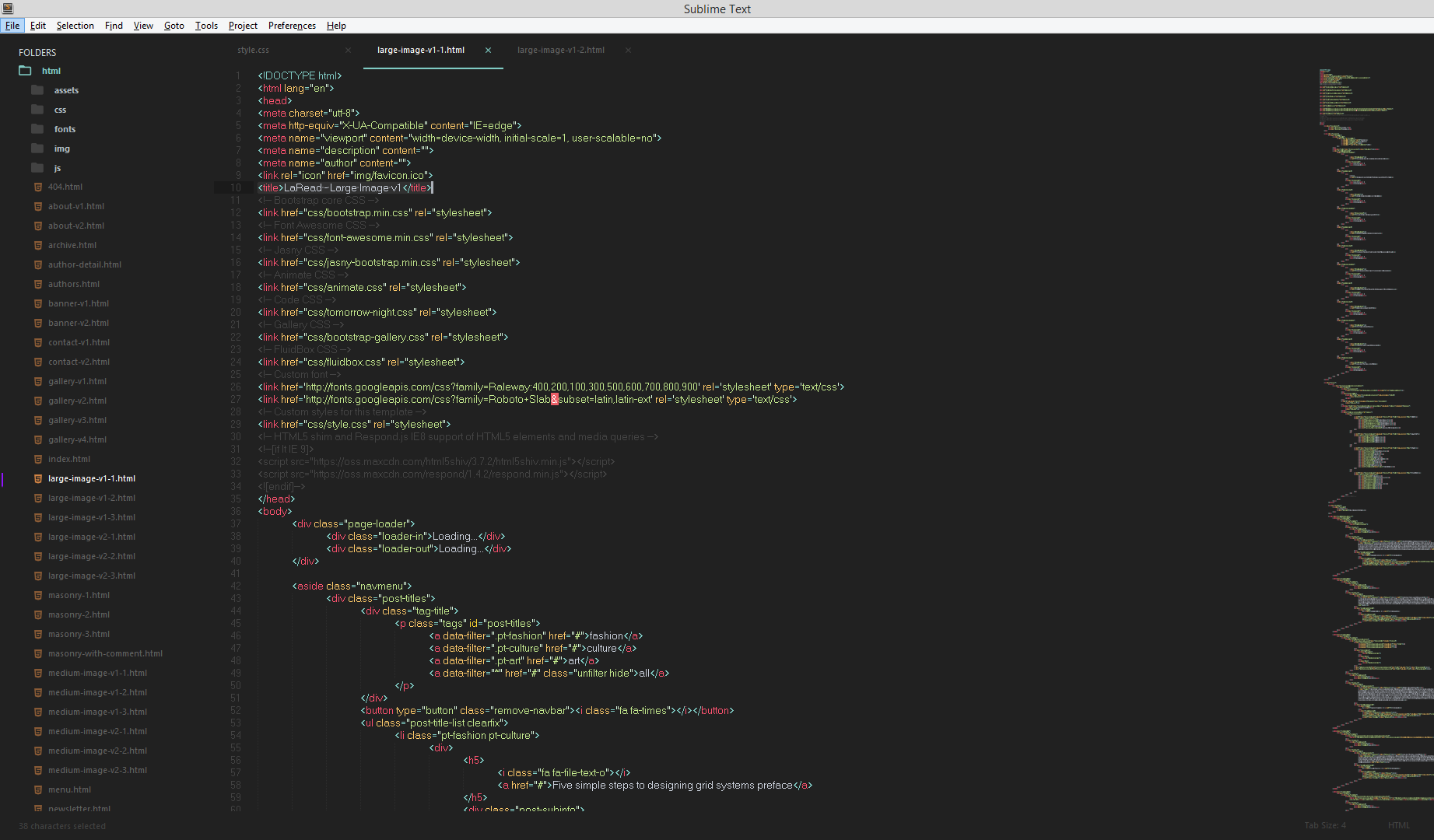
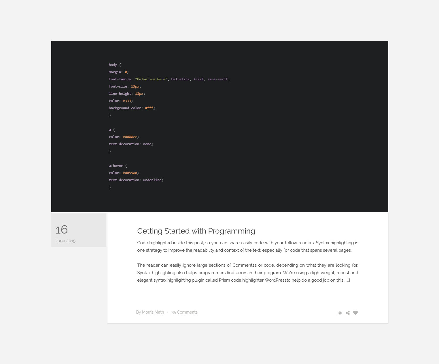
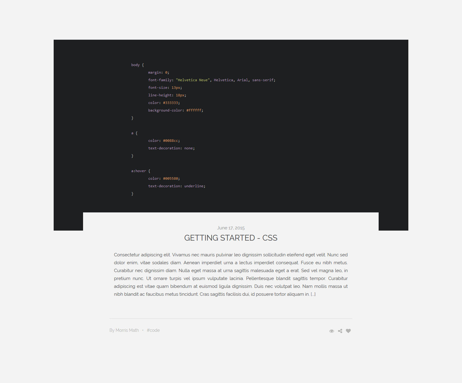
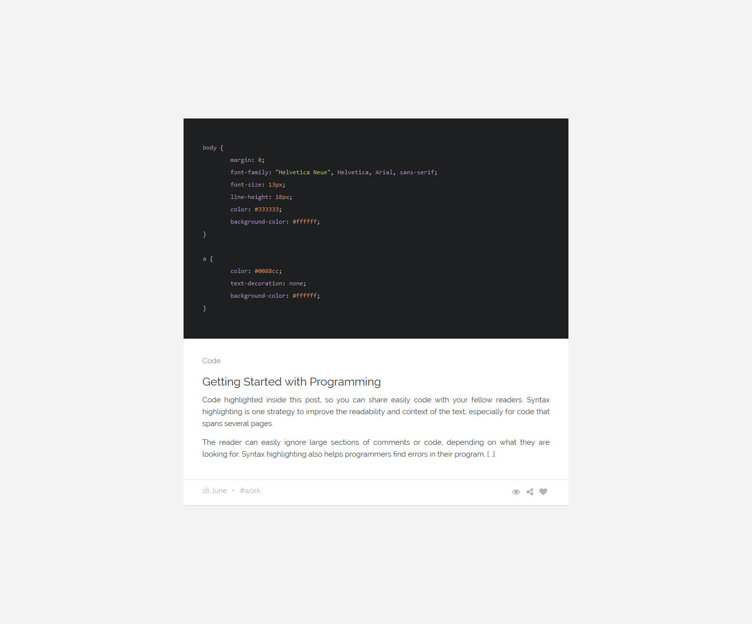
Screenshot: SublimeText
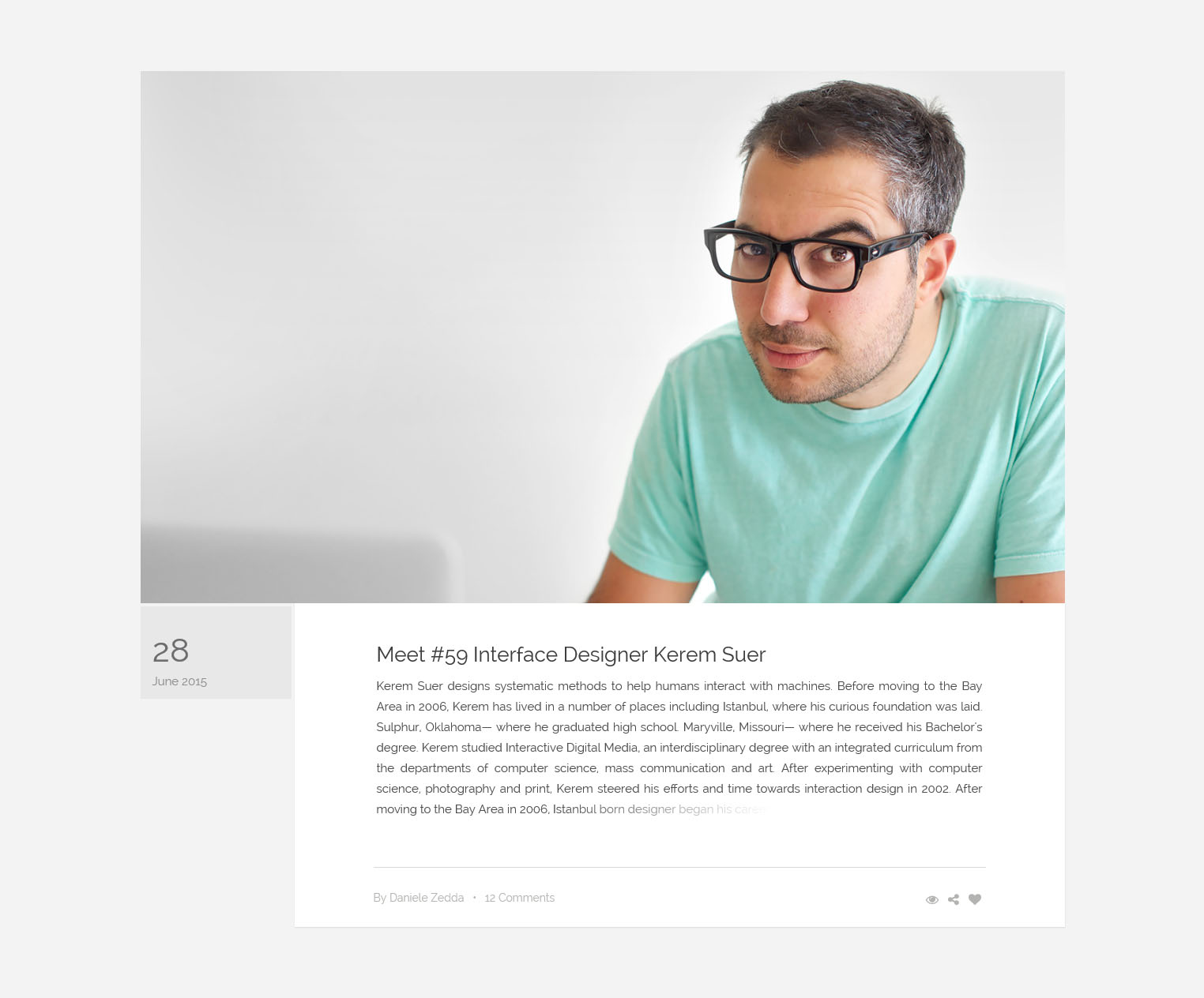
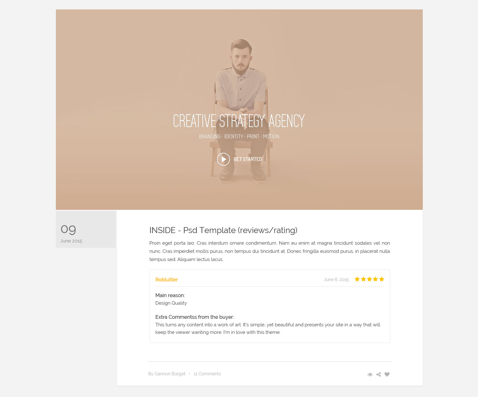
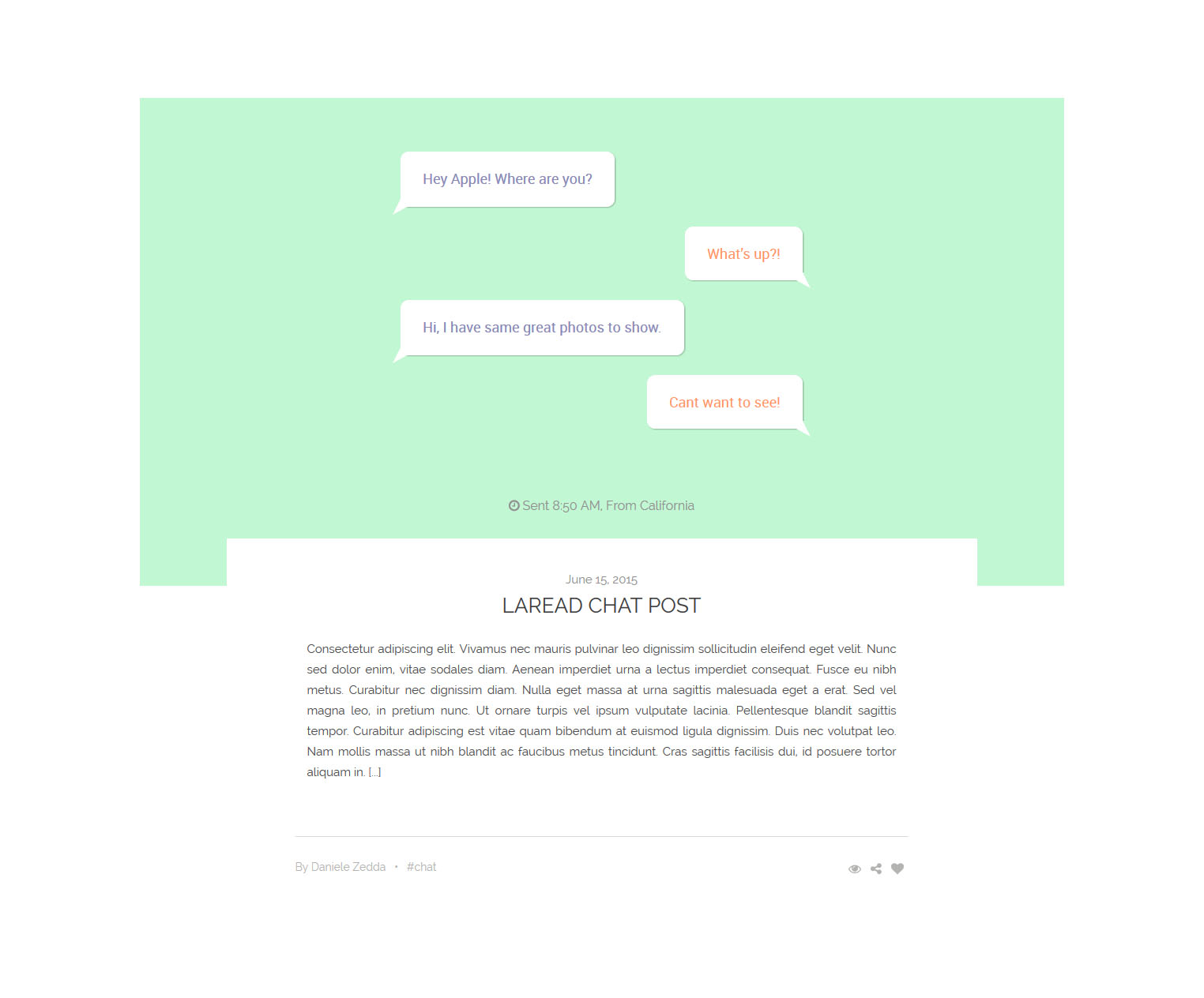
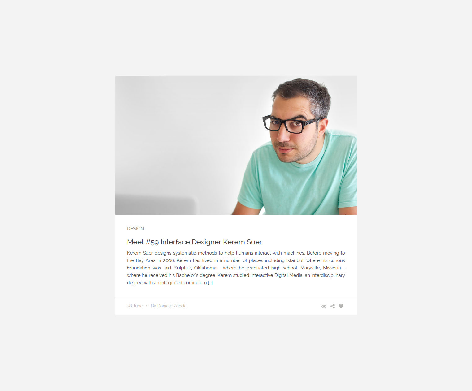
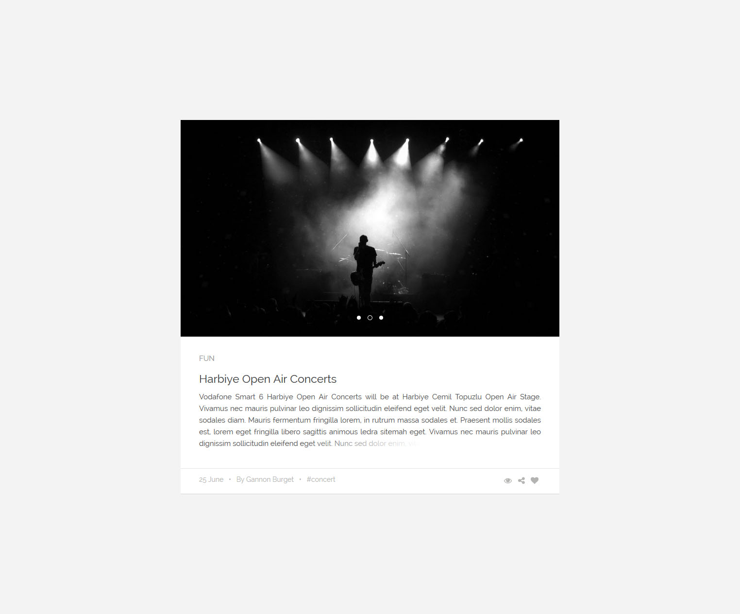
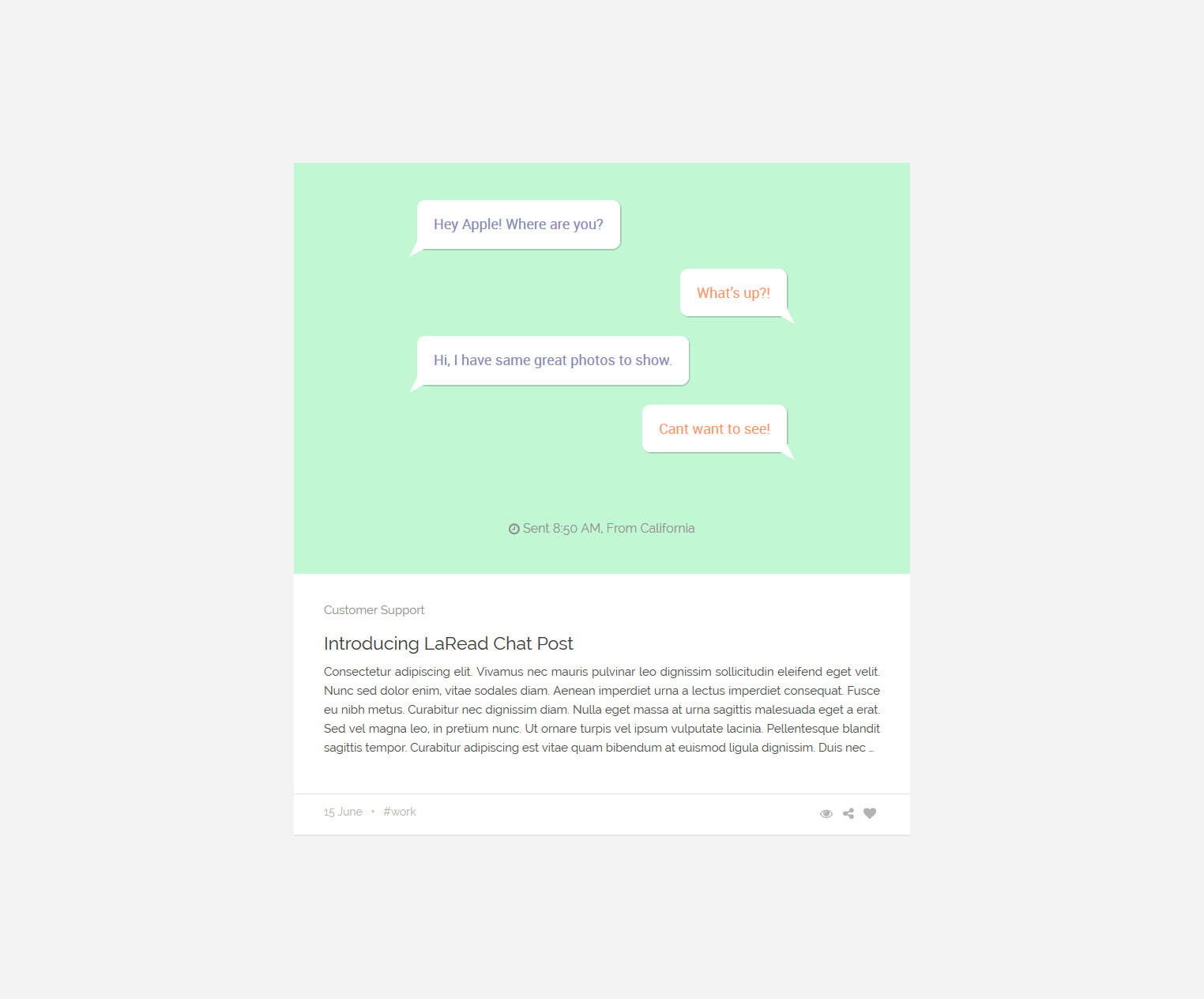
“LaRead” offers 5 different interfaces convenient for your style and contents. Supported by a large number of post / the widget format, it allows to create rich contents.
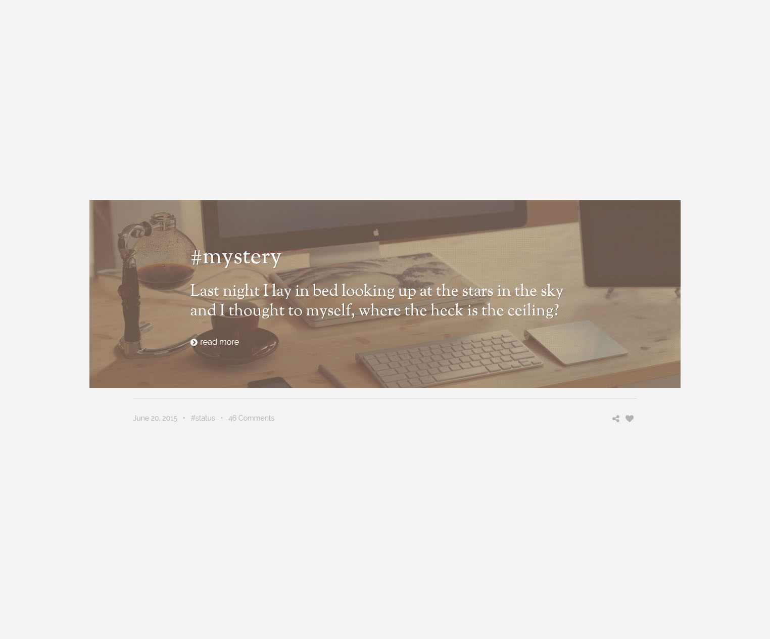
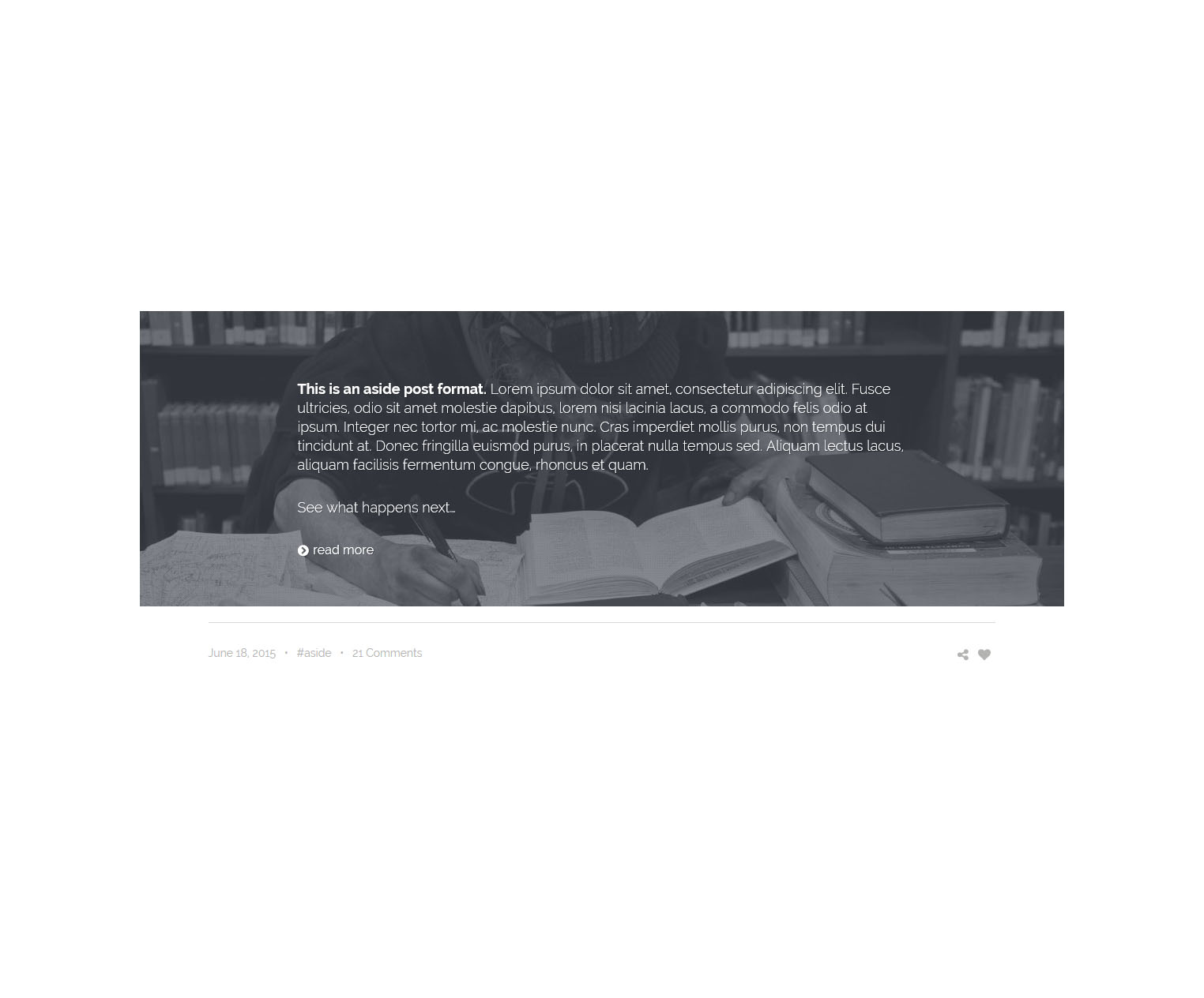
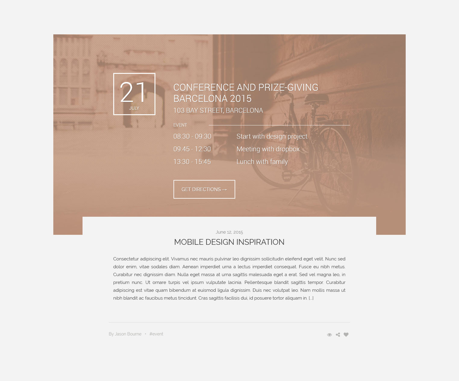
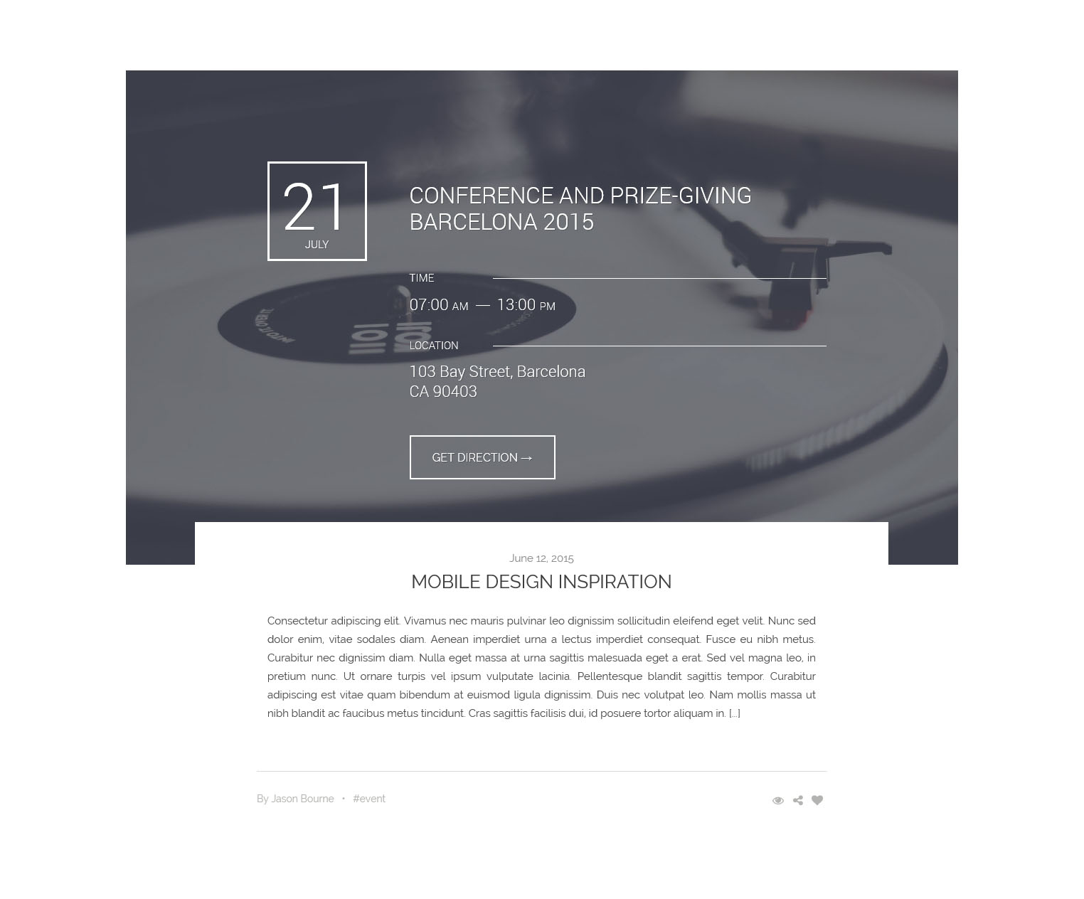
Large visual areas. LaRead gives you flexibility to create your contents. 17 different post formats help you to ideally publish contents that may need. In the large image version, retentively large visual fields, we allow to appeal to your eyes.
<article class="container-fluid">
    <div class="container">
        <div class="row post-items">
            <div class="post-item-banner">
                <img src="img/banner-40.jpg" />
            </div>
            <div class="col-md-2">
                <div class="post-item-short">
                    <span class="big-text">28</span>
                    <span class="small-text">June 2015</span>
                </div>
            </div>
            <div class="col-md-10">
                <div class="post-item">
                    <div class="post-item-paragraph">
                        <h2><a href="#">Meet #59 Interface Designer John Doe</a><a href="#" class="quick-read"><i class="fa fa-eye"></i></a></h2>
                        <p class="ellipsis-fade-six">Consectetur adipiscing elit. Vivamus nec mauris pulvinar leo dignissim sollicitudin eleifend eget velit. Nunc sed dolor enim, vitae sodales diam. Mauris fermentum fringilla lorem, in rutrum massa sodales et. Praesent mollis sodales est, eget fringilla libero sagittis eget. Nunc gravida varius risus ac luctus. Mauris ornare eros sed libero euismod ornare. Nulla id sem a mauris egestas pulvinar vitae non dui. Cras odio tortor, feugiat nec sagittis sed, laoreet ut mauris. In hac habitasse platea dictumst. Mauris non libero ligula, sed volutpat mauris. Duis facilisis elementum nisl, non aliquam enim tincidunt vitae. Donec laoreet est vitae erat auctor porttitor. <a href="#" class="more"></a></p>
                    </div>
                    <div class="post-item-info clearfix">
                        <div class="pull-left">
                            By <a href="#">Daniele Zedda</a>   •   <a href="#">12 Comments</a>
                        </div>
                        <div class="post-item-social">
                            <a href="#" class="quick-read"><i class="fa fa-eye"></i></a>
                            <a href="#" tabindex="0" role="button" data-toggle="popover" data-placement="top" data-content="<a href='#'><i class='fa fa-facebook'></i></a><a href='#'><i class='fa fa-twitter'></i></a>" class="pis-share"><i class="fa fa-share-alt"></i></a>
                            <a href="#" class="post-like"><i class="fa fa-heart"></i><span>28</span></a>
                        </div>
                    </div>
                </div>
            </div>
        </div>
    </div>
</article>
Large_Image_v1
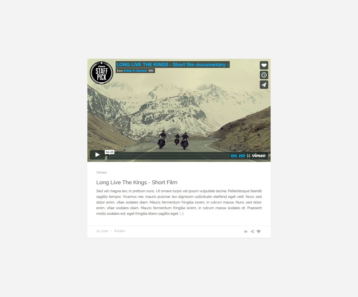
All contents are in the center to the accompaniment of a minimal design. Laread offers several great features that will become a habit for you, to maximize the user experience. Everything that you need is right where they should be.
<article class="container-fluid post-default">
    <div class="container">
        <div class="row post-items">
            <div class="post-item-banner">
                <img src="img/banner-3.jpg" />
            </div>
            <div class="col-md-10 col-md-offset-1">
                <div class="post-item post-item-centered">
                    <div class="post-item-paragraph">
                        <span class="date">June 28, 2015</span>
                        <h2><a href="#">VASAVA STUDIO</a></h2>
                        <p>Consectetur adipiscing elit. Vivamus nec mauris pulvinar leo dignissim sollicitudin eleifend eget velit. Nunc sed dolor enim, vitae sodales diam. Aenean imperdiet urna a lectus imperdiet consequat. Fusce eu nibh metus. Curabitur nec dignissim diam. Nulla eget massa at urna sagittis malesuada eget a erat. Sed vel magna leo, in pretium nunc. Ut ornare turpis vel ipsum vulputate lacinia. Pellentesque blandit sagittis tempor. Curabitur adipiscing est vitae quam bibendum at euismod ligula dignissim. Duis nec volutpat leo. Nam mollis massa ut nibh blandit ac faucibus metus tincidunt. Cras sagittis facilisis dui, id posuere tortor aliquam in. <a href="#" class="more">[...]</a></p>
                    </div>
                    <div class="post-item-info clearfix">
                        <div class="pull-left">
                            By <a href="#">Morris Math</a>   •   <a href="#">#branding</a>
                        </div>
                        <div class="pull-right post-item-social">
                            <a href="#"><i class="fa fa-eye"></i></a>
                            <a href="#" tabindex="0" role="button" data-toggle="popover" data-trigger="focus" data-placement="top" data-content="<a href='#'><i class='fa fa-facebook'></i></a><a href='#'><i class='fa fa-twitter'></i></a>" class="pis-share"><i class="fa fa-share-alt"></i></a>
                            <a href="#" class="post-like"><i class="fa fa-heart"></i><span>28</span></a>
                        </div>
                    </div>
                </div>
            </div>
        </div>
    </div>
</article>
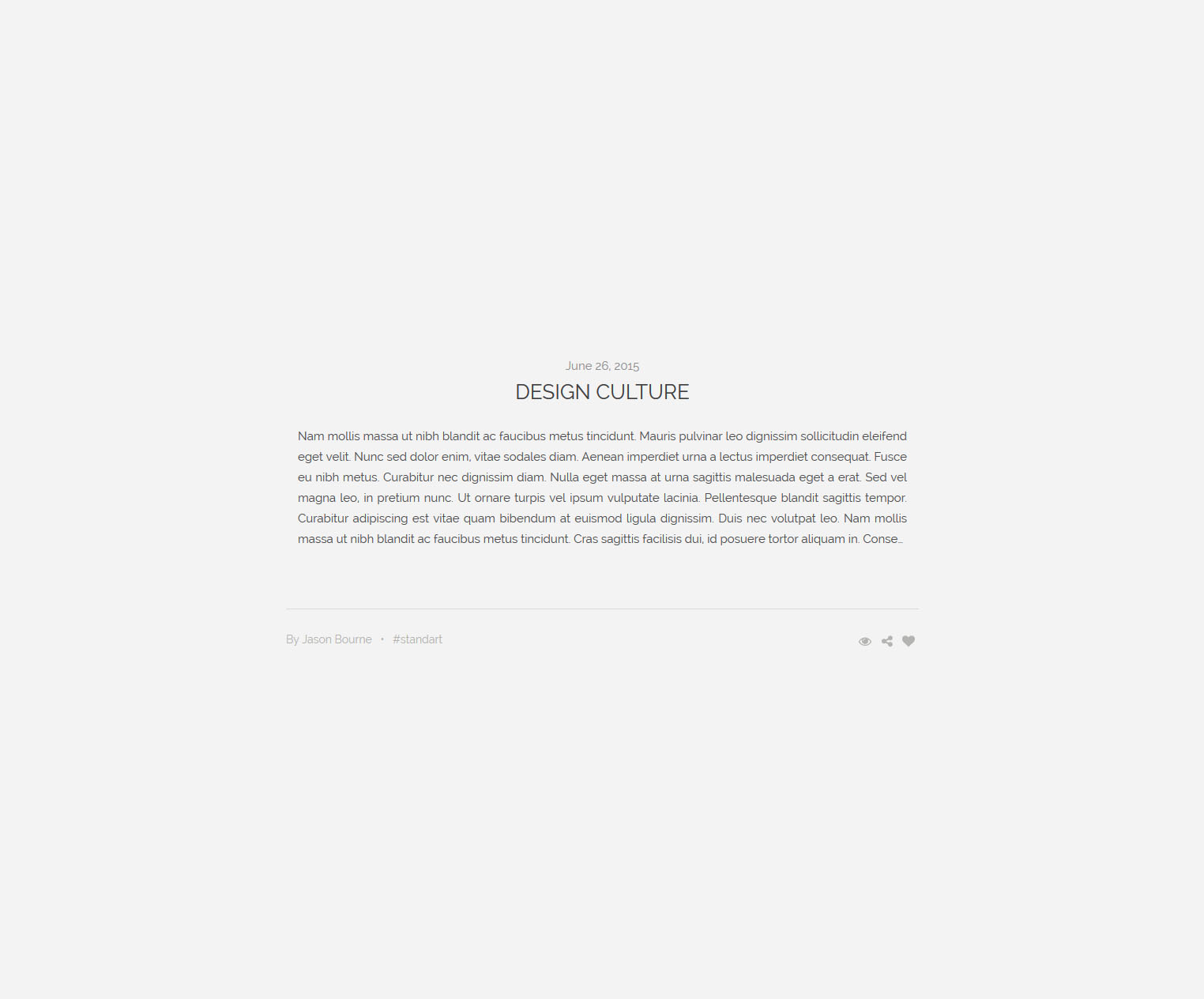
Large_Image_v2
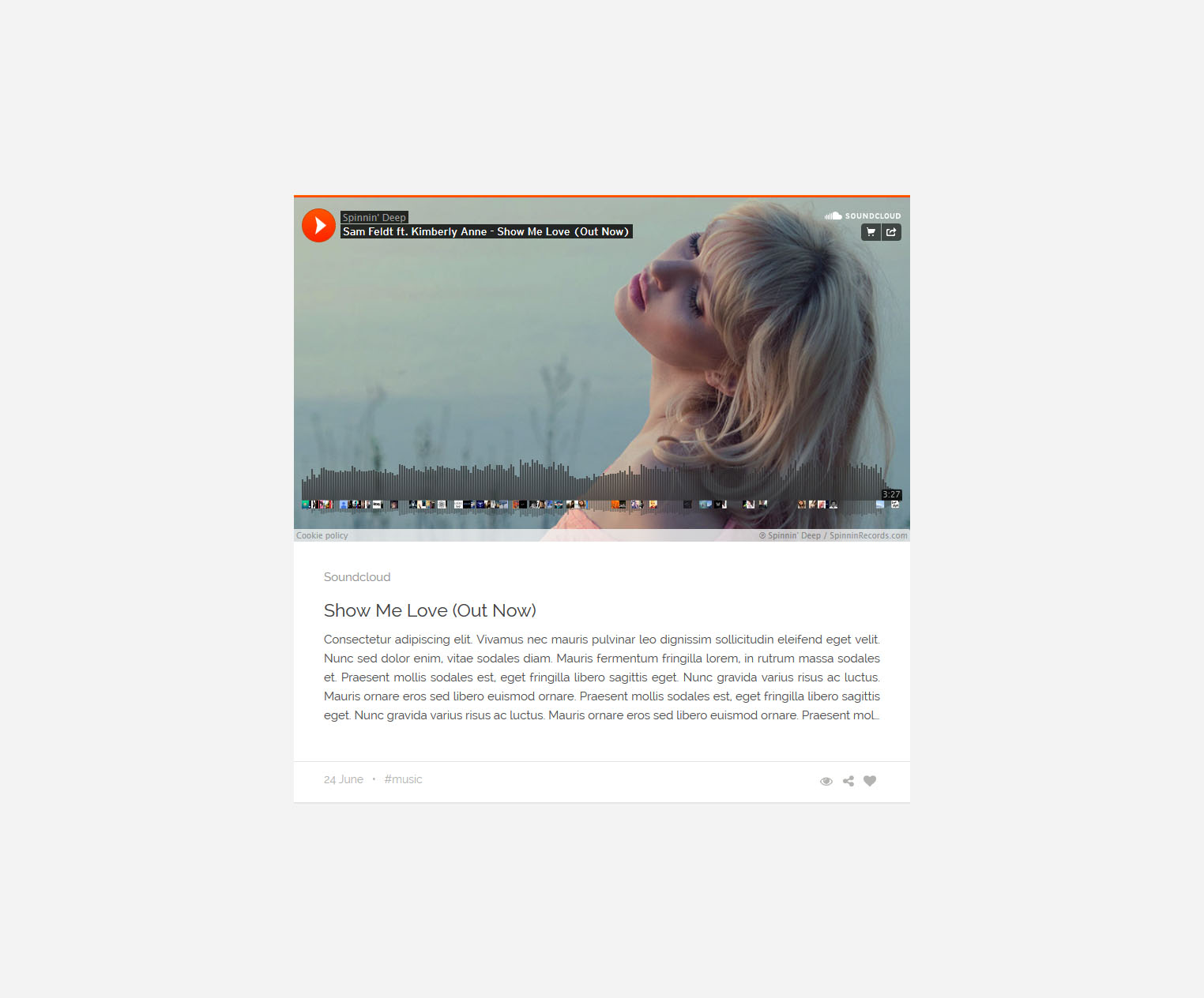
We reinterpreted our blogs with our different perspectives. Not less, not more. However, it is certainly more different and elegant than the others. In this version, 19 different widgets that will accompany for your contents ready to use. We have a good relationship with numbers.
<article class="container-fluid post-default">
    <div class="container-medium">
        <div class="row post-items">
            <div class="post-item-banner">
                <img src="img/banner-40.jpg" />
            </div>
            <div class="col-md-12">
                <div class="post-item">
                    <div class="post-item-paragraph">
                        <a href="#" class="mute-text">DESIGN</a>
                        <h3><a href="#">Meet #59 Interface Designer John Doe</a></h3>
                        <p>Consectetur adipiscing elit. Vivamus nec mauris pulvinar leo dignissim sollicitudin eleifend eget velit. Nunc sed dolor enim, vitae sodales diam. Aenean imperdiet urna a lectus imperdiet consequat. Fusce eu nibh metus. Curabitur nec dignissim diam. Nulla eget massa at urna sagittis malesuada eget a erat. Sed vel magna leo, in pretium nunc. Ut ornare turpis vel ipsum vulputate lacinia. Pellentesque blandit sagittis tempor. <a href="#" class="more">[...]</a></p>
                    </div>
                    <div class="post-item-info clearfix">
                        <div class="pull-left">
                            <span>28 June</span>   •   By <a href="#">Daniele Zedda</a>   •   <a href="#">#work</a>
                        </div>
                        <div class="pull-right post-item-social">
                            <a href="#"><i class="fa fa-eye"></i></a>
                            <a href="#" tabindex="0" role="button" data-toggle="popover" data-trigger="focus" data-placement="top" data-content="<a href='#'><i class='fa fa-facebook'></i></a><a href='#'><i class='fa fa-twitter'></i></a>" class="pis-share"><i class="fa fa-share-alt"></i></a>
                            <a href="#" class="post-like"><i class="fa fa-heart"></i><span>28</span></a>
                        </div>
                    </div>
                </div>
            </div>
        </div>
    </div>
</article>
Medium_Image_v1
If your fingers are so fast about producing contents, this version may accompany to you. As in other versions, it is literally in harmony with mobile devices. In this version, we achieved to fit more content on the screen.
<article class="row post-medium">
<div class="col-md-5">
<div class="row"><img src="img/banner-57.jpg" /></div>
</div>
<div class="col-md-7">
<div class="post-item">
<div class="medium-post-box clearfix">
<div class="post-item-paragraph">
<div class="pm-top-info clearfix">
<div class="pull-left">
<a href="#">DESIGN</a>
</div>
<div class="pull-right post-item-social">
<a href="#"><i class="fa fa-eye"></i></a>
<a href="#" tabindex="0" role="button" data-toggle="popover" data-trigger="click" data-placement="top" data-content="<a href='#'><i class='fa fa-facebook'></i></a><a href='#'><i class='fa fa-twitter'></i></a>" class="pis-share"><i class="fa fa-share-alt"></i></a>
<a href="#"><i class="fa fa-heart"></i></a>
</div>
</div>
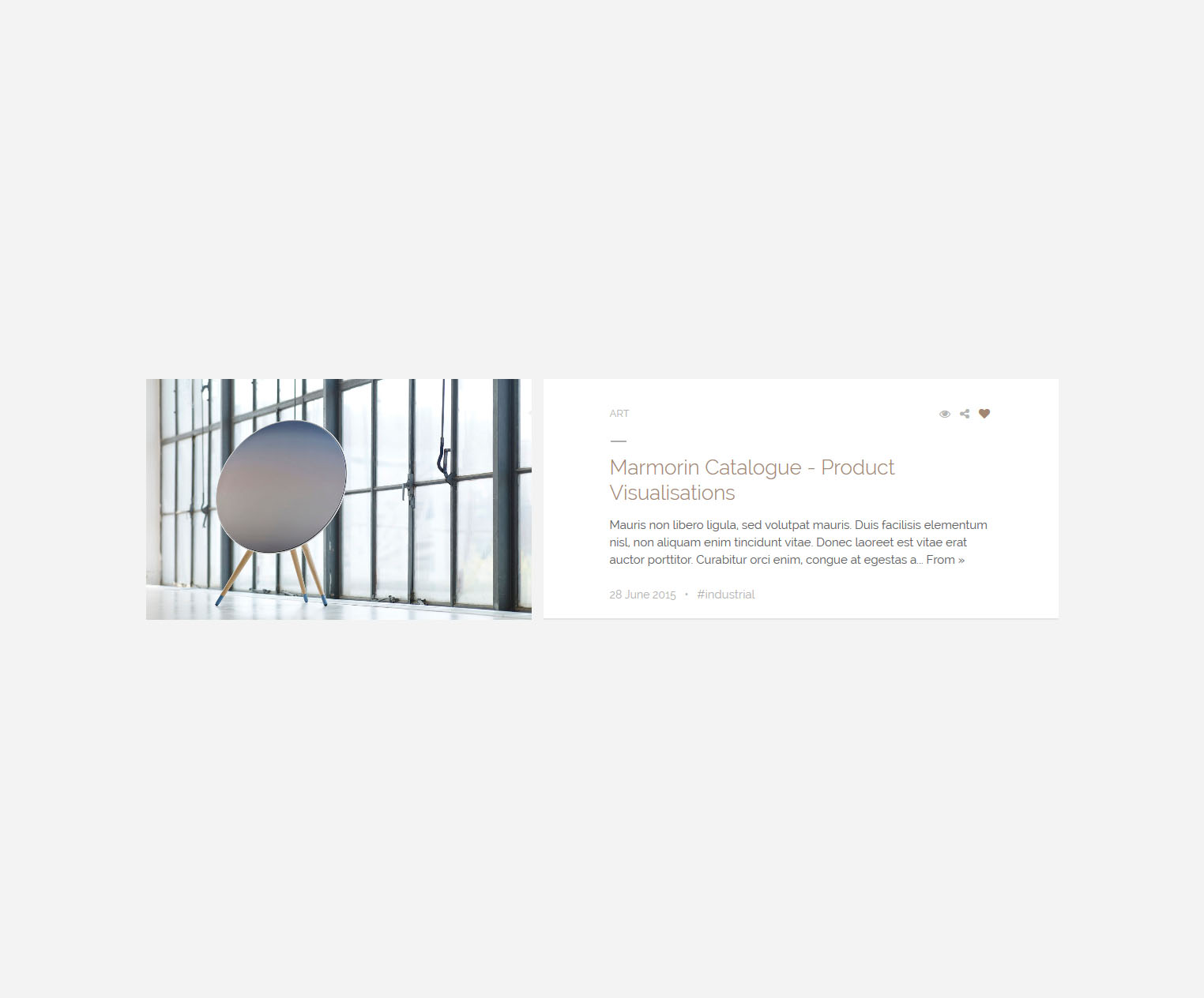
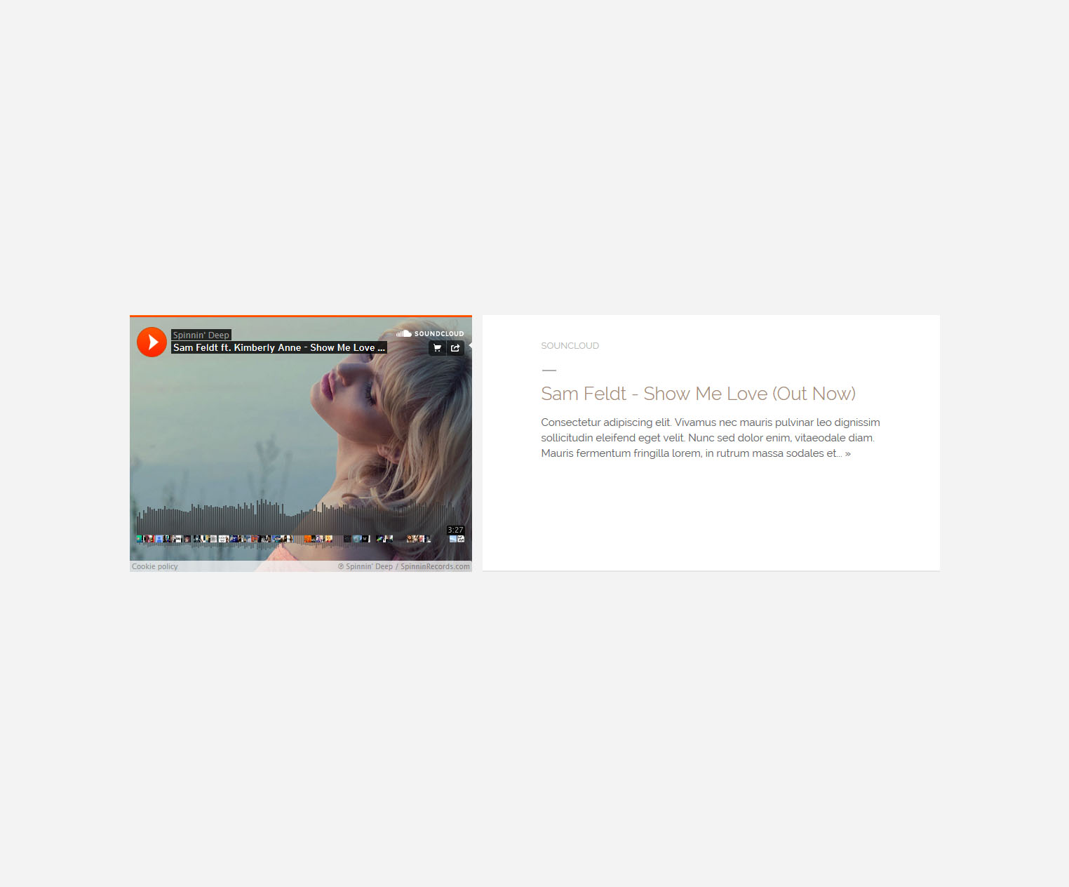
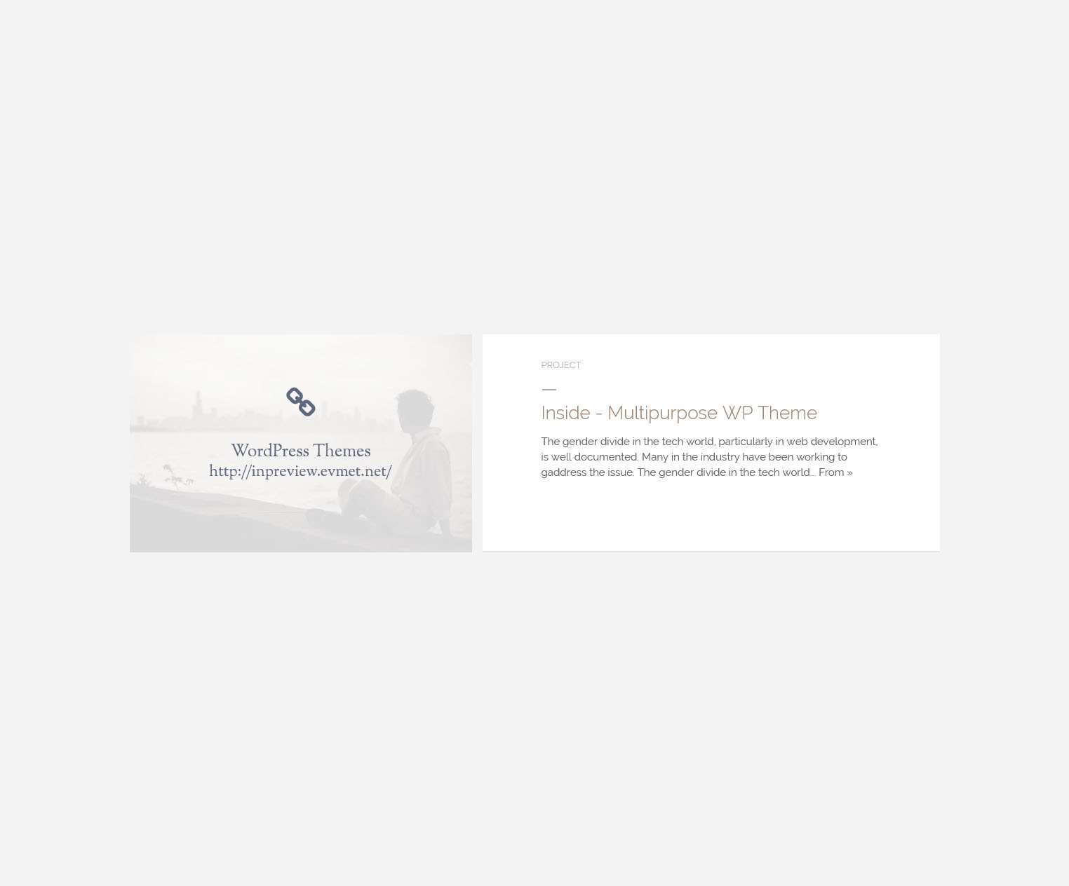
<h2><a href="#">Marmorin Catalogue - Product Visualisations</a></h2>
<p class="ellipsis-readmore">The gender divide in the tech world, particularly in web development, is well documented. Many in the industry have been working to address the issue. The gender divide in the tech world, particularly in web development, is well documented. Many in the industry have been working to address the issue. The gender divide in the tech world, particularly in web development, is well documented. Many in the industry have been working to address the issue. <a class="more" href="#">From »</a></p>
</div>
<div class="pm-bottom-info clearfix">
<div class="pull-left">
28 June 2015 • <a href="#">#art</a>
</div>
</div>
</div>
</div>
</div>
</article>
Medium_Image_v2
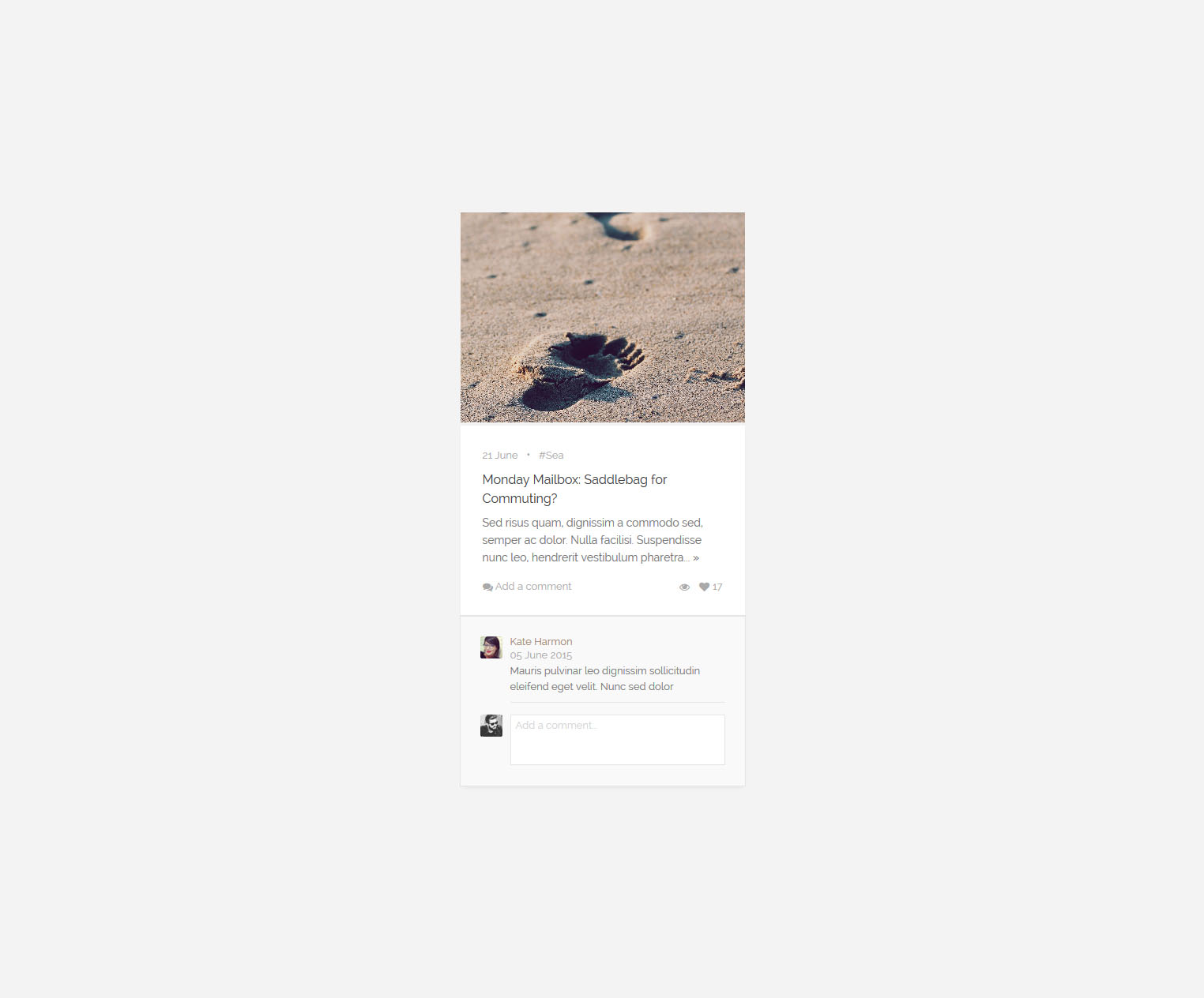
And more contents. Do not care about the image size, “LaRead” does not make concessions to ensure to you for the best user experience. When everything is drifting from time tunnel, you can stop the time by select contents what you want. The choice is yours.
<article class="col-md-4 masonry-row col-sm-6 lifestyle">
    <img src="img/banner-138.jpg" alt="">
    <div class="masonry-content">
        <div class="links">
            <span>28 June</span>   •   <a href="#">#Fly</a>
        </div>
        <a href="#">We Honor Panem’s District Heroes</a>
        <p class="spot ellipsis-readmore">Vivamus nec mauris pulvinar leo dignissim sollicitudin eleifend eget velit. Nunc sed dolor enim, vitae sodales diam.  Mauris fermentum fringilla lorem, in rutrum massa sodales et.  Vivamus nec mauris pulvinar leo dignissim sollicitudin eleifend eget velit. Nunc sed dolor enim, vitae sodales diam.  Mauris fermentum fringilla lorem, in rutrum massa sodales et.  <a href="#" class="more">»</a></p>

        <div class="links">
            <div class="icons">
                <a href="#"><i class="fa fa-eye"></i></a>
                <a href="#"><i class="fa fa-heart"></i>8</a>
            </div>
            <!-- comment toggle -->
            <a href="#" data-comments-id="1" class="open-comments"><i class="fa fa-comments"></i> Add a comment</a>
        </div>

        <!-- comment block start -->
        <div id="comments-1" class="comments">
            <div class="media">
                <a class="pull-left" href="#">
                    <img class="media-object" width="28" height="28" alt="28x28" src="img/banner-30.jpg" />
                </a>
                <div class="media-body">
                    <h4 class="media-heading">Kate Harmon</h4>
                    <span class="date">22 Jun 2015</span>
                    <p class="comment-detail">Cras sit amet nibh libero, in gravida nulla. Nulla vel metus scelerisque ante sollicitudin commodo. Cras purus odio, vestibulum in vulputate at, tempus viverra turpis. Fusce condimentum nunc ac nisi vulputate fringilla. Donec lacinia congue felis in faucibus.</p>
                </div>
            </div>
            <div class="media">
                <a class="pull-left" href="#">
                    <img class="media-object" width="28" height="28" alt="28x28" src="img/banner-30.jpg" />
                </a>
                <div class="media-body">
                    <textarea placeholder="Add a comment..."></textarea>
                </div>
            </div>
        </div>
        <!-- comment block finish -->
    </div>
</article>
Masonry
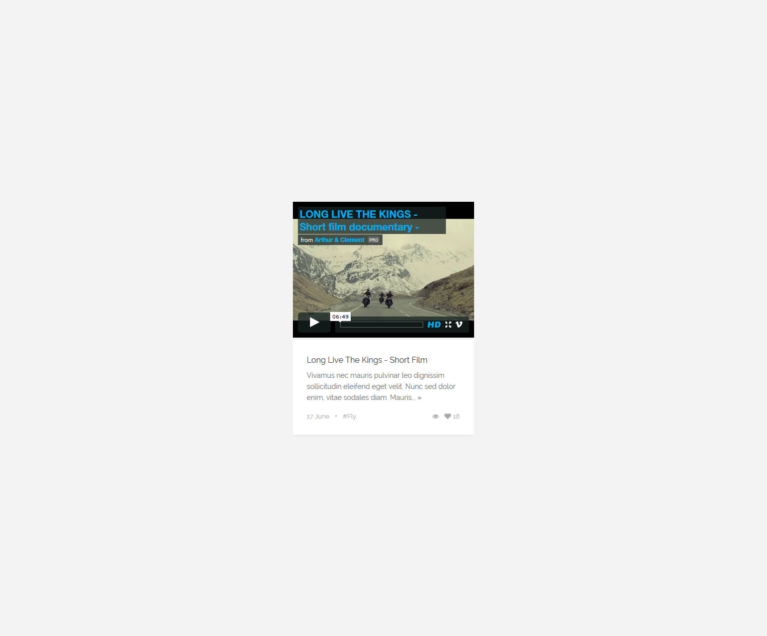
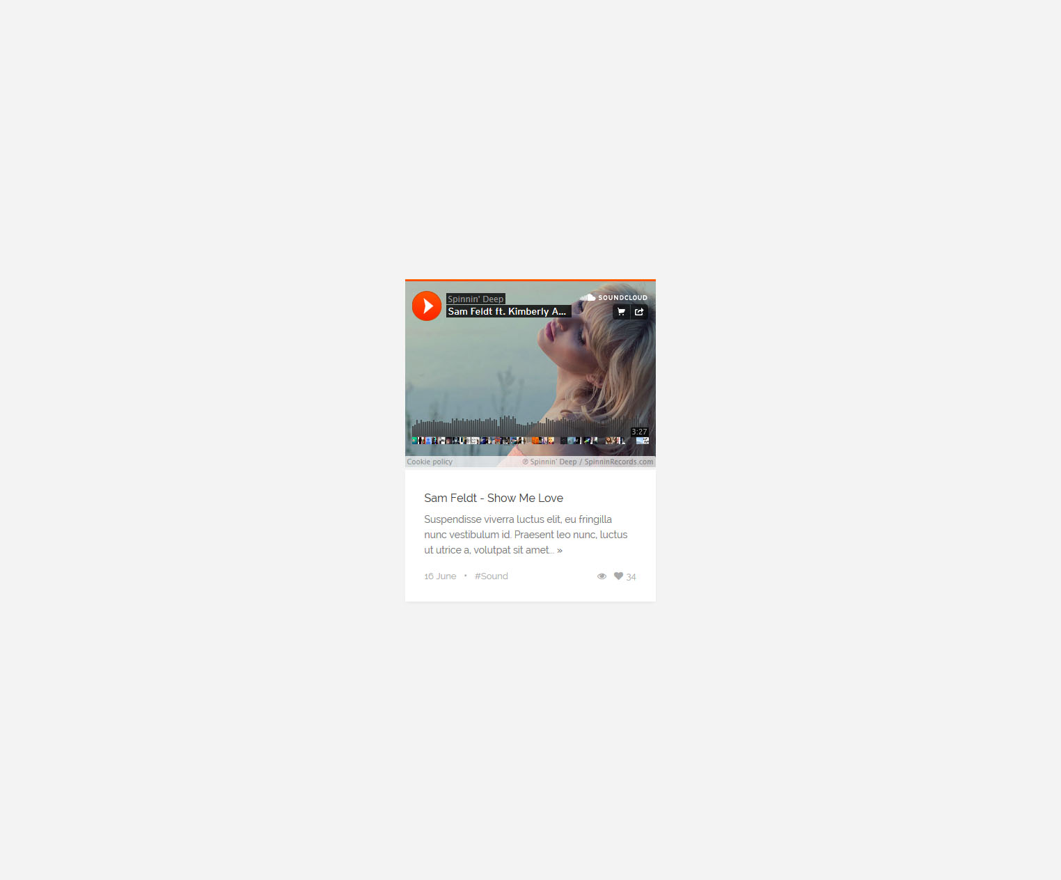
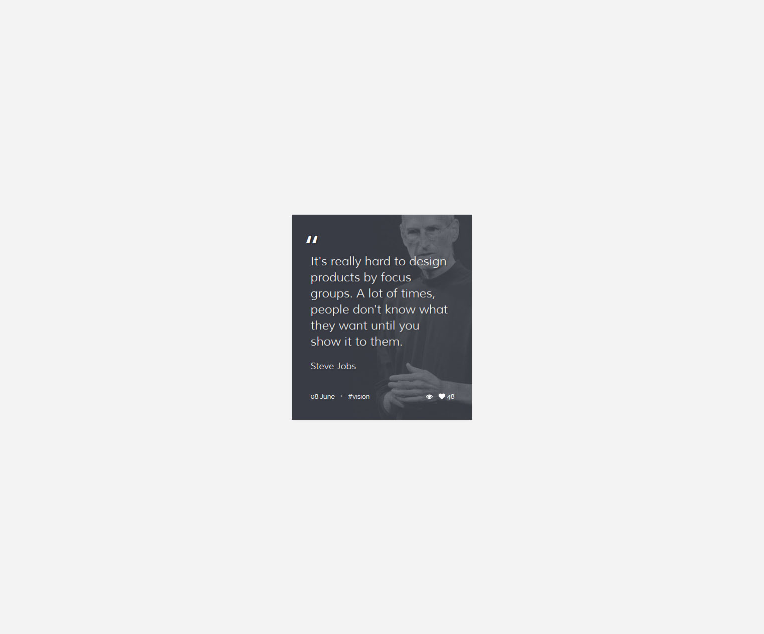
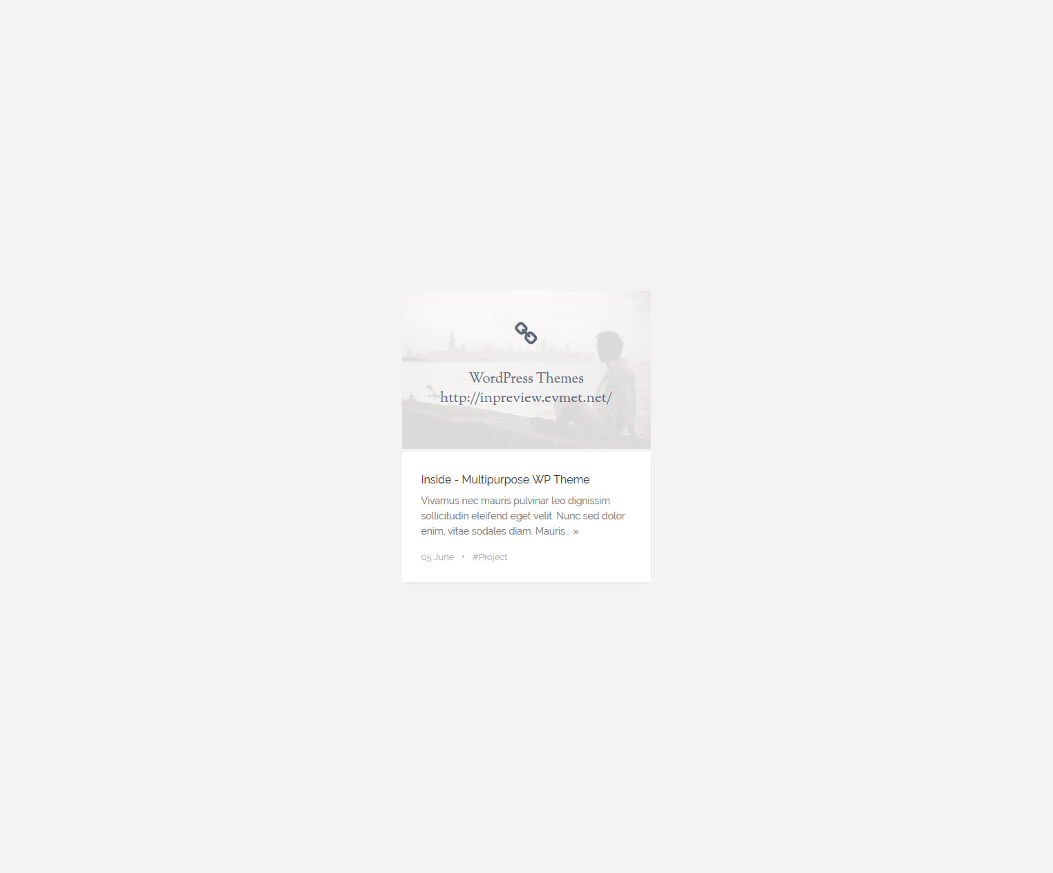
LaRead gives you flexibility to create your contents. 17 different post formats help you to ideally publish contents that may need.
17 Diffrent Post Types
LaRead have 2 Push Bar for Posts, changing data-navbar-type for one of them. Choosing beetwen are "default" or "full". All version supported isotope filtering.
<div class="get-post-titles">
    <button type="button" class="navbar-toggle push-navbar" data-navbar-type="default">
        <i class="fa fa-bars"></i>
    </button>
</div>
for isotope filter.
<div class="container">
    <p class="tags" id="post-titles">
        <a data-filter=".pt-fashion" href="#">fashion</a>
        <a data-filter=".pt-culture" href="#">culture</a>
        <a data-filter=".pt-art" href="#">art</a>
        <a data-filter="*" href="#" class="unfilter hide">all</a>
    </p>
</div>
.
.
.
.
.
<li class="pt-fashion pt-culture">
    <div>
        <h5>
            <i class="fa fa-file-text-o"></i>
            <a href="#">Five simple steps to designing grid systems preface</a>
        </h5>
        <div class="post-subinfo">
            <span>June 28</span>   •
            <span>2 Comments</span>
        </div>
    </div>
</li>
default Push Bar (for posts)
full Push Bar (for posts)
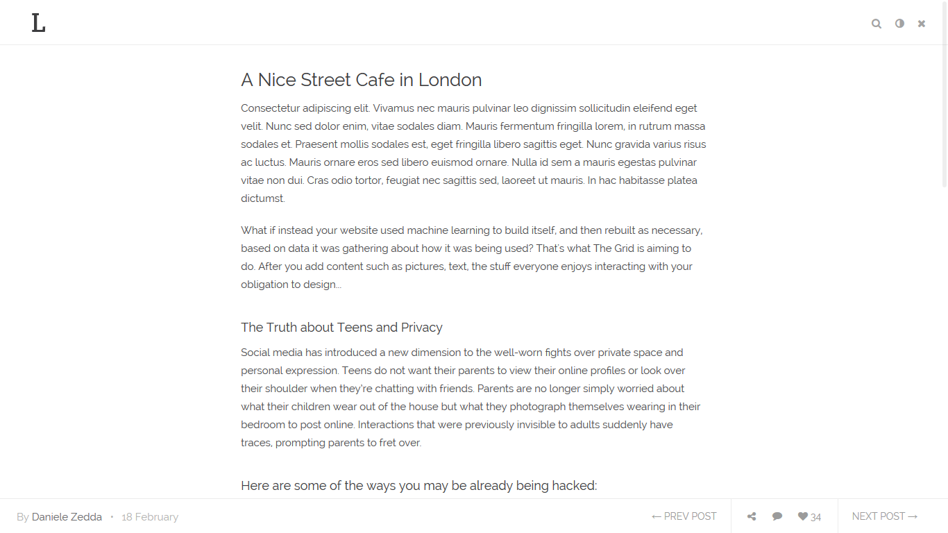
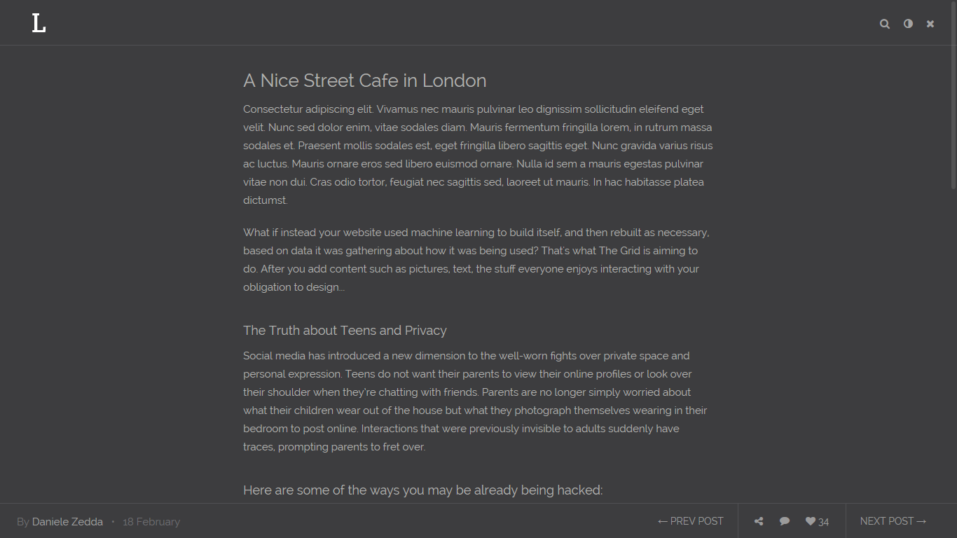
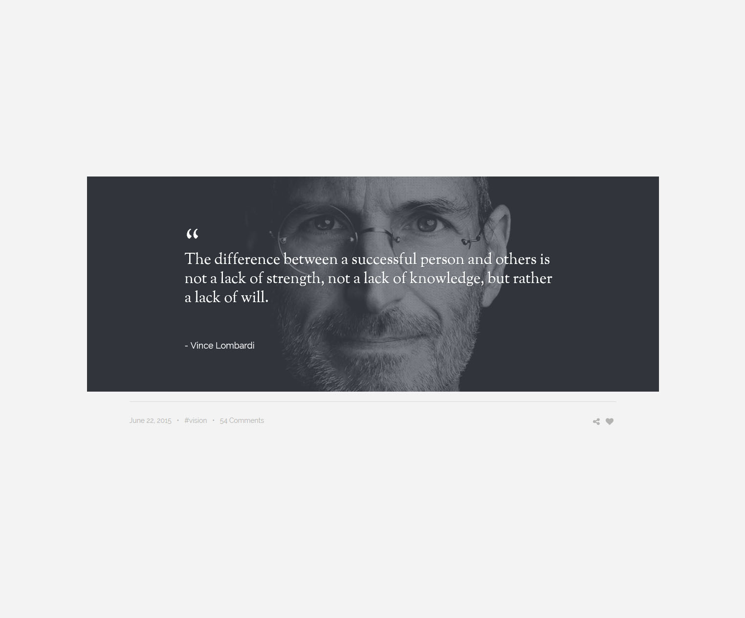
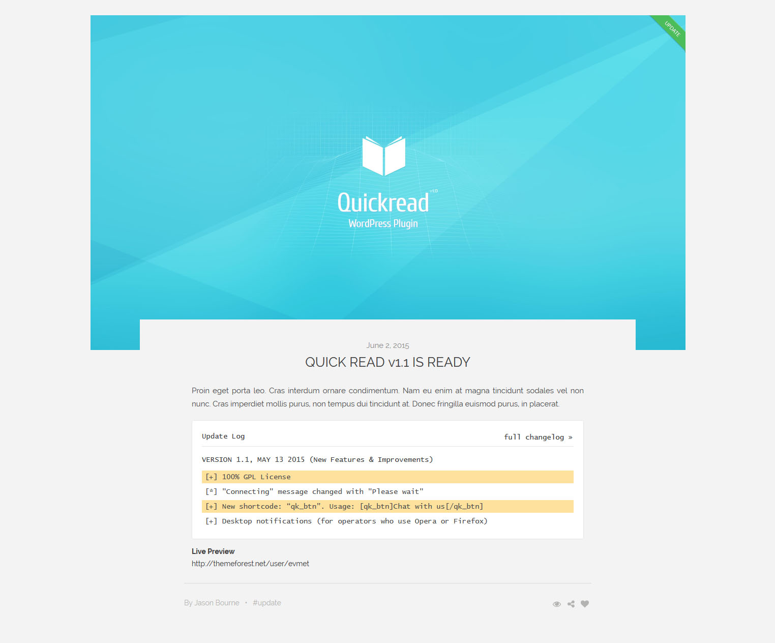
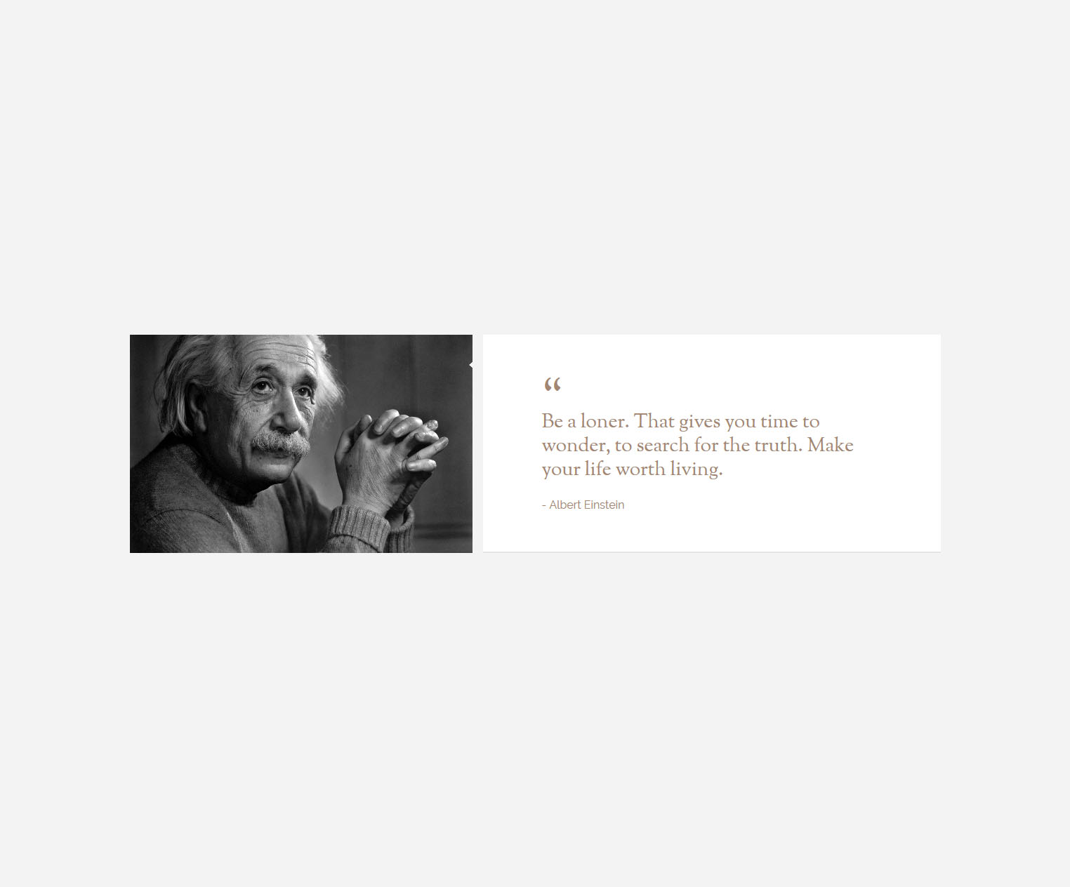
Quick Read have 2 types, light and dark. Changing class for one of them. Choosing beetwen are "qr-white-theme" or "qr-black-theme" (line 4). Also you can change after opening (middle button on top-left buttons group in screenshot).
<a href="#" class="quick-read"><i class="fa fa-eye"></i></a>


<div id="quick-read" class="qr-white-theme">
    <div class="quick-read-head">
        <div class="container">
            <a href="#" class="qr-logo"></a>
            <div class="qr-tops">
                <a href="#" class="qr-search-close"><i class="fa fa-times"></i></a>
                <a href="#" class="qr-search"><i class="fa fa-search"></i></a>
                <a href="#" class="qr-change"><i class="fa fa-adjust"></i></a>
                <a href="#" class="qr-close"><i class="fa fa-times"></i></a>
            </div>
            <form role="search" class="qr-search-form">
                <input type="text" placeholder="Search LaRead">
            </form>
        </div>
    </div>
    <div class="container">
        <div class="col-md-8 col-md-offset-2">
            <div class="qr-content post-item-paragraph">


            <!-- content goes here -->


            </div>
        </div>
    </div>
    <div class="quick-read-bottom">
        <p class="qr-info">By <a href="#">Daniele Zedda</a>   •   18 February</p>
        <div class="qr-nav">
            <a href="#" class="qr-prev">← PREV POST</a>
            <a href="#" class="qr-share" tabindex="0" role="button" data-toggle="popover" data-placement="top" data-trigger="click" data-content="<a href='#'><i class='fa fa-facebook'></i></a><a href='#'><i class='fa fa-twitter'></i></a>"><i class="fa fa-share-alt"></i></a>
            <a href="#" class="qr-comment"><i class="fa fa-comment"></i></a>
            <a href="#" class="qr-like"><i class="fa fa-heart"></i> 34</a>
            <a href="#" class="qr-next">NEXT POST →</a>
        </div>
    </div>
    <div class="quick-read-bottom qr-bottom-2 hide">
        <div class="qr-nav">
            <a href="#" class="qr-prev">← PREV POST</a>
            <p class="qr-info">By <a href="#">Daniele Zedda</a>   •   18 February</p>
            <a href="#" class="qr-next">NEXT POST →</a>
            <a href="#" class="qr-like"><i class="fa fa-heart"></i> 34</a>
            <div class="qr-sharebox">
                <span>Share on</span>
                <a href='#'><i class='fa fa-facebook'></i></a>
                <a href='#'><i class='fa fa-twitter'></i></a>
            </div>
        </div>
    </div>
</div>
light/dark versions
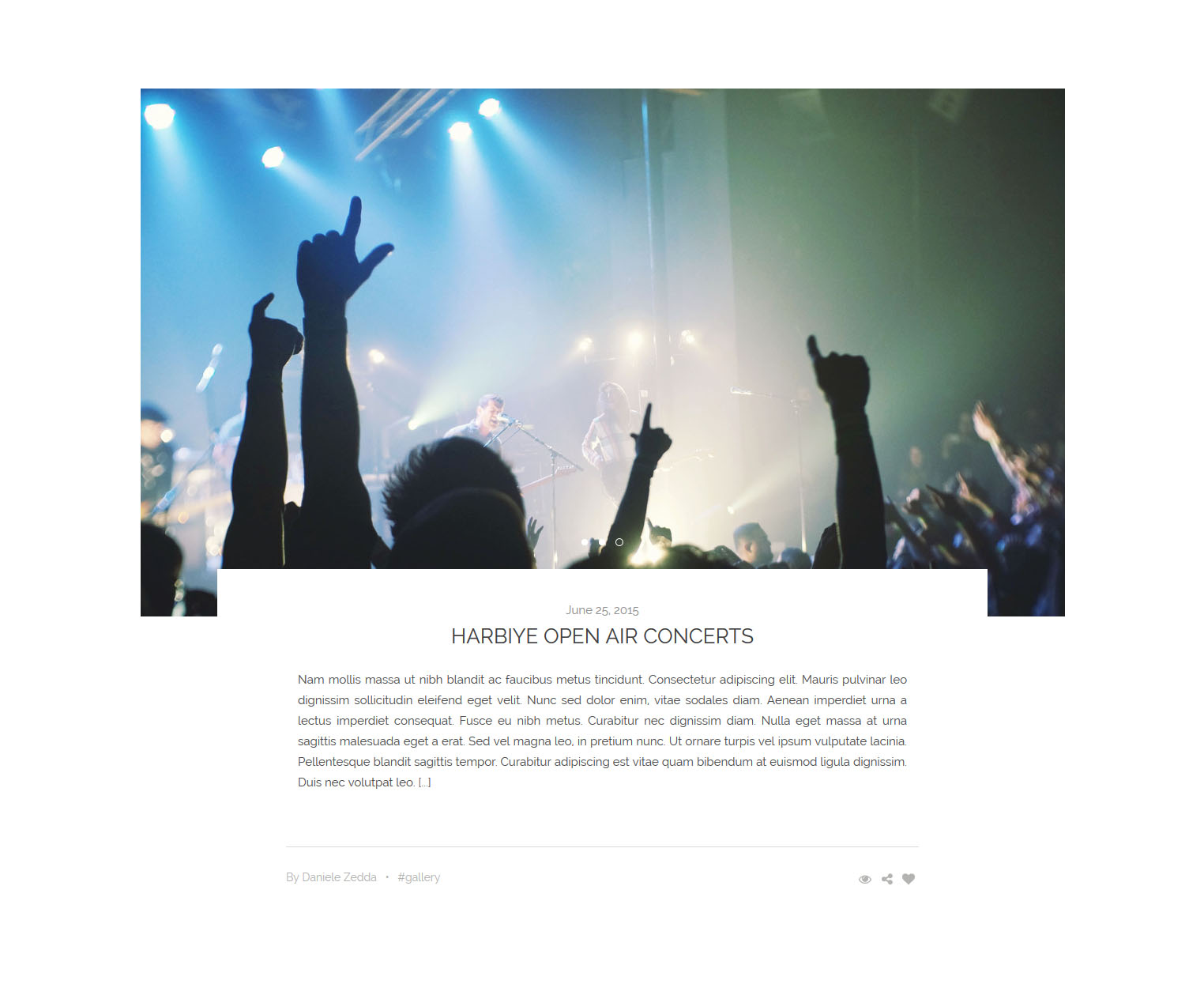
Gallery detail working relation 'data-gallery-item="x"' (line 2) and 'id="list-x"' (line 18).
<article class="masonry-row col-md-4 col-sm-6 mg-item">
    <a href="#" data-gallery-item="list-2">
        <span class="mg-banner">
            <img src="img/banner-165.jpg" alt="">
        </span>
        <span class="mg-content">
            <span class="mg-top">Photography <b><i class="fa fa-heart"></i></b></span>
            <h6>Patricia Urquiola</h6>
        </span>
    </a>
</article>
.
.
.
.
.
.
<div id="list-1" class style="display:none">
    <a href="img/banner-1.jpg" title="Discovering the World 1" data-gallery>
        <img src="img/banner-1.jpg" alt="Discovering the World">
    </a>
    <a href="img/banner-2.jpg" title="Discovering the World 2" data-gallery>
        <img src="img/banner-2.jpg" alt="Discovering the World">
    </a>
    <a href="img/banner-3.jpg" title="Discovering the World 3" data-gallery>
        <img src="img/banner-3.jpg" alt="Discovering the World">
    </a>
    <a href="img/banner-4.jpg" title="Discovering the World 4" data-gallery>
        <img src="img/banner-4.jpg" alt="Discovering the World">
    </a>
    <a href="img/banner-5.jpg" title="Discovering the World 5" data-gallery>
        <img src="img/banner-5.jpg" alt="Discovering the World">
    </a>
</div>

<div id="blueimp-list-1" class="blueimp-gallery-controls blueimp-gallery gallery-template-white">
    <div class="slides"></div>
    <div class="gallery-detail-info">
        <h3 class="title"></h3>
        <div class="gallery-share">
            <span class="date">27 JUNE</span>
            <a href="#" tabindex="0" role="button" data-toggle="popover" data-trigger="focus" data-placement="top" data-content="<a href='#'><i class='fa fa-facebook'></i></a><a href='#'><i class='fa fa-twitter'></i></a>" class="pis-share"><i class="fa fa-share-alt"></i></a>
            <a href="#"><i class="fa fa-expand"></i></a>
            <a href="#"><i class="fa fa-heart"></i> 24</a>
        </div>
    </div>
    <a class="prev"><i class="fa fa-angle-left"></i></a>
    <a class="next"><i class="fa fa-angle-right"></i></a>
    <a class="close">×</a>
    <ol class="indicator"></ol>
</div>
We thank to great artists who give a magic touch to our theme with their unique work so much.
Content is king.
If you need any help. Feel free to contact me anytime. I will reply in 24 hours.
Send a mail from my
Themeforest Profile |
Facebook | Twitter
Free Fonts Used (google fonts)
Photo Credits
Tools
JS
© 2015 Evmet. Pure Passion